
In today’s fast-paced, information-rich world, the ability to create stunning infographics is more than just a design skill — it’s a powerful way to turn complex data into clear, engaging visuals.
Infographics blend visual storytelling with data presentation, making information not only easy to understand but also memorable and highly shareable. In this guide, we will explore winning strategies, tips, and tools to create stunning infographics but first, let’s learn about the fundamentals.
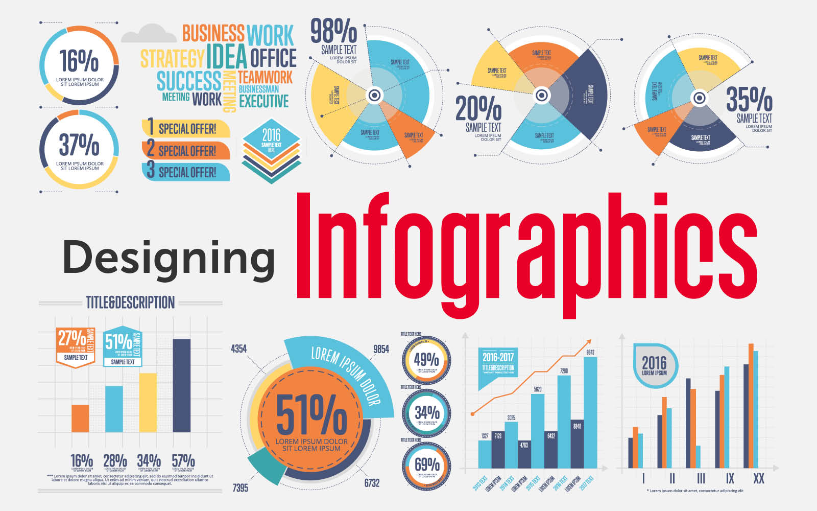
Infographic Fundamentals
Before diving into creation, let’s understand what makes infographics effective. Think of an infographic as a visual story where every element serves a purpose. Just as a good story has a beginning, middle, and end, an effective infographic guides viewers through information in a logical, engaging way.
Step 1: Planning Your Infographic 📝
Defining Your Purpose
Start by answering these essential questions:
- What is the core message you want to convey?
- Who is your target audience?
- What action do you want viewers to take?
- What data or information will support your message?
Gathering and Organizing Data
Think of your data as the building blocks of your story. You’ll need to:
- Collect reliable data from credible sources
- Organize information hierarchically
- Identify key statistics and memorable facts
- Look for compelling relationships between data points
Step 2: Designing Your Infographic
Layout Fundamentals
Consider the natural flow of information. Western readers typically scan from top to bottom and left to right. Your layout should:
- Guide the eye naturally through information
- Create clear sections for different topics
- Maintain adequate white space for readability
- Use a consistent grid system
Color Theory in Practice
Colors aren’t just decorative – they’re communication tools:
- Use your brand colors if applicable
- Limit your palette to 2-3 main colors with 2-3 accent colors
- Consider color psychology (e.g., blue for trust, green for growth)
- Ensure sufficient contrast for readability
Step 3: Visual Elements and Typography
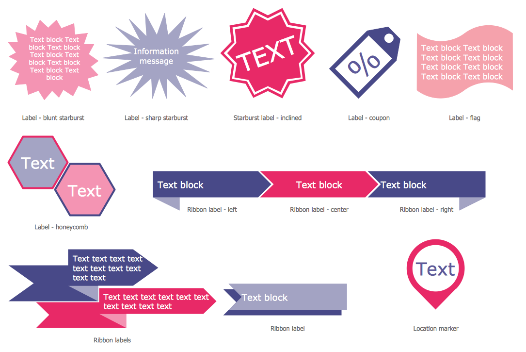
Choosing the Right Visual Elements
- Icons should be simple and instantly recognizable
- Charts and graphs must match your data type
- Images should enhance, not distract from, your message
- Illustrations should maintain a consistent style
Typography Best Practices
- Use no more than 2-3 font families
- Establish a clear hierarchy with font sizes
- Ensure readability at different scales
- Maintain consistent spacing between elements
Step 4: Tools and Software
Professional Design Tools
- Adobe Illustrator: Industry standard for vector graphics
- Adobe Photoshop: Perfect for image manipulation
- Figma: Excellent for collaborative design work
- Sketch: Popular among Mac users
Online Infographic Makers
- Canva: User-friendly with extensive templates
- Piktochart: Great for data visualization
- Visme: Strong business-focused features
- Infogram: Excellent for interactive infographics
Discover 5 Best AI Design Tools in 2025 (for Non-Designers)
Step 5: Technical Considerations
File Formats
- SVG: Best for web and scalability
- PNG: Good for transparency needs
- PDF: Perfect for print materials
- JPG: Suitable for simple web images
Resolution Requirements
- Web: 72-96 DPI
- Print: 300 DPI minimum
- Large Format: 150-200 DPI
Advanced Tips for Professional Results
Data Visualization
- Choose appropriate chart types for your data
- Maintain proportional relationships
- Use consistent scales
- Provide clear context for numbers
Storytelling Techniques
- Create a compelling narrative arc
- Use visual metaphors effectively
- Include a clear call to action
- Build emotional connections through design
Closing Thoughts
Creating stunning infographics is a perfect blend of art and strategy. It’s not just about making data look good — it’s about organizing information in a way that captures attention, simplifies complexity, and drives your message home.
By mastering these principles and practicing consistently, you’ll develop the skills to create stunning infographics that inform, engage, and inspire your audience. Whether you’re sharing insights on social media, enhancing blog content, or presenting data in a report, well-crafted infographics can elevate your storytelling and boost your content’s impact.
FAQs
1. What is the ideal size for an infographic?
The standard width is typically between 800-1000 pixels, while the length can vary based on content. For better shareability, aim for a maximum 1:4 width-to-length ratio.
2. How much text should an infographic have?
To maintain visual impact, keep text to about 25-30% of the design. Use concise statements, bullet points, and short phrases to deliver key information clearly.
3. What chart types work best for different data sets?
Choose chart types based on your data’s story:
- Bar charts for comparisons
- Line graphs for trends over time
- Pie charts for parts of a whole
- Scatter plots for showing relationships or correlations
4. How can I create stunning infographics that are accessible?
Ensure your infographics are inclusive by:
- Adding alt text for images and charts
- Using high contrast ratios for readability
- Providing a text version or description of the data
5. What is the best file size for sharing infographics online?
For fast loading times and quality retention, keep your infographic file size under 1.5MB.
6. How do I protect my infographics from unauthorized use?
Safeguard your work by:
- Adding watermarks subtly but clearly
- Using digital signatures or metadata
- Including attribution requirements for sharing
7. Should I use templates or design infographics from scratch?
A: Templates are great for beginners or quick projects, but custom designs offer more flexibility, creativity, and stronger brand alignment.
8. How do I make my infographics mobile-friendly?
Ensure responsiveness by:
- Designing with vertical layouts
- Using legible fonts and large clickable areas
- Testing on multiple devices before publishing
9. What’s the best way to incorporate branding into infographics?
Blend branding seamlessly by using your brand’s colors, fonts, and logo consistently—keeping it subtle yet recognizable.
10. How often should I update my infographics?
Refresh your infographics whenever:
- Data changes or becomes outdated
- Design trends evolve to maintain a modern look
By following these best practices, you’ll be able to create stunning infographics that not only capture attention but also communicate information effectively. Whether for blogs, social media, or presentations, well-designed infographics can elevate your content and boost engagement.


